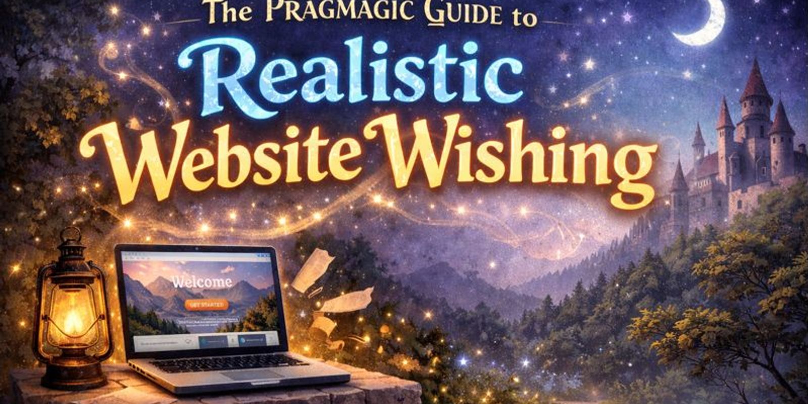

I'll Tell You What You Want, What You Really, Really Want
Everyone wants their new website to have that special "wow" factor that grabs attention immediately. You probably want cool animations, instant load times, and a design that makes your competitors look like they are stuck in the past. We completely understand this excitement because you don't want your business to get lost in a sea of boring, generic templates.
You are likely looking for a site that people actually enjoy using on a daily basis. This means including subtle bits of polish, easy navigation, and buttons that practically beg to be clicked by your visitors. You want your website to feel like a warm welcome to your brand rather than a dusty, confusing corporate manual that nobody wants to read.
The problem isn't actually your wish for a great site; it is usually the strategy used to get there. Our job as developers is to help you see the difference between a flashy feature that helps your business grow and one that just gets in the way. Since we offer unlimited edits, we can experiment together until we find that perfect balance for your company. That same mindset shapes our web design services, where performance and conversion matter just as much as appearance.
The 3-Question Pragmagic Rule
Before you decide to add any new feature to your website, you should always ask three very important questions:
- First: Does this help my customer actually do something like calling me or buying a product?
- Second: Is the "cool factor" worth making a user wait for the page to load?
- Finally: Is there a much simpler or lighter way to achieve this same feeling?
This is what we call the "Pragmagic" approach to modern web design and development. It is all about finding that elusive sweet spot where your site looks amazing to every visitor but still works perfectly on every device. By following these rules, we ensure that your beautiful new design doesn't accidentally drive away frustrated customers who are in a hurry.
At a Glance: Doing it Wrong vs. Doing it Right
| Feature | The "Technical" Trap | The Pragmagic Way |
|---|---|---|
| Animation | Flashy effects that slow things down | Subtle moves that feel premium |
| Mobile | Just shrinking the desktop version | Making buttons easy to tap with a thumb |
| SEO | Repeating keywords over and over | Writing helpful stuff people actually read |
| Speed | Adding too many "fix-it" plugins | Starting with clean, fast code |
| Design | Copying trends that don't fit you | Making it look modern but easy to use |
| Everyone | Just checking boxes for compliance | Making sure everyone can use the site |
The "Make It Pop" Wish: Cool Moves vs. Fast Loads
If you take the wrong approach to animations, you might end up with moving backgrounds and falling stars that look messy. This often causes the site to take ten seconds to load and freeze up on most modern smartphones. While it might look "cool" on a high-end desktop, it creates a terrible experience for the average person trying to find your business.
The Pragmagic way involves using subtle fades and smooth transitions that make the site feel high-end without the wait. These small touches provide a sense of quality and fluidity that reinforces your brand without hogging all the processing power on a phone. By using browser-native features, we keep things moving fast while still delivering that premium, polished look you really want.
The "Mobile" Wish: Easy to Use vs. Just Fitting
Many designers simply "shrink" a desktop site and call it mobile-friendly, but this rarely works well for real users. The menu becomes tiny, the text is impossible to read without a magnifying glass, and buttons are far too small to tap accurately. Even if the site technically fits on a phone screen, it doesn't mean your customers will actually be able to use it.
We design the mobile version of your website specifically for human hands and typical daily environments. This means making buttons big enough to tap while walking and placing the most important info right where your thumb naturally rests. A truly mobile-friendly site should be easy to navigate with just one hand while you are busy doing other things throughout your day.
The "Modern Look" Wish: Following Trends vs. Being You
It is easy to get distracted by "modern" layouts that feature giant videos and tiny, low-contrast text that is hard to see. While these designs might look like a fancy magazine in a static mockup, they often hide your phone number and make it difficult to find help. You never want to sacrifice your business goals just to follow a design trend that might be gone next year.
Our approach uses clean, modern fonts and plenty of white space to make your site look fresh and professional. We keep your contact information front-and-center so that customers never have to look for more than two seconds to hire you. It is about creating a tool that looks new and exciting but functions as a powerful engine for your business growth.
The "Google" Wish: Helping People vs. Hunting Robots
In the past, people thought putting the same keyword in every sentence would help them rank higher on Google search results. This makes your content incredibly hard to read and annoying for your actual customers who are looking for real answers. Modern search engines are smart enough to know when you are trying to trick them, and they will often penalize your site for it.
The Pragmagic way is to write helpful articles that actually answer the questions your customers are asking every day. We make sure all the "behind-the-scenes" technical stuff is set up correctly so that Google understands exactly what you do and who you serve. This builds long-term authority and trust with both the search engines and the real people who visit your website. When a business needs help beyond on-page basics, a stronger local SEO plan helps extend that visibility into map results and long-tail searches.
The "Fast Loading" Wish: Clean Code vs. Patchwork Plugins
Installing ten different "speed-up" plugins is a common mistake that often leads to more problems than it solves. These plugins frequently fight each other, causing images to disappear or contact forms to stop working entirely. Even if a speed test says the site is fast, the actual experience for your customers can feel clunky, broken, and completely unreliable.
We prefer to make images the right size before uploading them and write our code by hand to keep everything lean and efficient. Your site feels fast because it is actually built correctly from the ground up, not because a plugin is trying to hide a mess. This creates a stable foundation that will keep performing well for years without requiring constant technical fixes or updates.
The "Everyone Can Use It" Wish: Common Sense vs. Compliance
Simply running an automated test and fixing the errors it shows is not enough to make a site truly accessible. While the colors might be technically legal, the site can still feel like a confusing maze for anyone who isn't a tech expert. You want a website that is logical and easy to navigate for every single person who might need your services or products.
We build every site with a clear hierarchy of headings and simple, obvious paths for users to follow. This ensures that the site works perfectly for someone using a screen reader as well as for your grandma using an old tablet. Accessibility isn't just about following rules; it is about making sure that no potential customer is ever left behind or frustrated.
Making It Real
The difference between a great site and a forgettable one isn't about how many flashy bells and whistles you can cram in. It is about making sure your website actually helps your business grow without ever frustrating or confusing your customers. Pragmagic is all about being realistic with your design choices so that your website can finally start working as hard as you do. If you want that kind of thinking applied to your next build, contact us and we can talk through what your site actually needs.